Your site might have lots of traffic, but if your website conversion rates are down, your bottom line will take a huge hit. It’s absolutely crucial to optimize your web design and site functionality to increase your conversion rates. All your efforts to drive traffic, like SEO or digital marketing will be futile, if that traffic will bounce away uninterested.
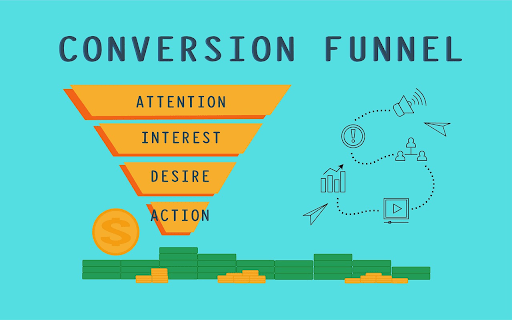
Website conversions are a direct indicator of sales volume. A conversion can be a click on a ‘Call to Action’ button, adding a product to a shopping cart, filling a lead generation form, or simply providing an email address to sign up for a newsletter. The ultimate conversion will always be buying a product, but you can have multiple conversions along the marketing funnel.
What is your website conversion rate?
Conversion rate is the percentage of your web visitors that complete your desired goal. It’s a direct function of the usability and branding of your website.
There are of course a host of tactics you can employ to improve conversion rate and SEO ranking – such as continuously improving and updating your site with new content, products, deals, videos, blogs etc. A stagnant website will miss out on many opportunities to increase revenue and fall down the SEO ranking order.
CRO – or conversion rate optimization, uses the traffic you already have to drive conversions, instead of increasing traffic to your website. This is the best way to get the most bang for your marketing buck and once you have a higher-converting website, you can start investing in driving traffic again.
Here are eight practical and proven ways to improve website conversion rates:
1. Use pictures
Image optimization can help instantly communicate your value proposition better than most copy. Rarely does anyone have time to read your product descriptions in full, but if you’re lucky enough to find a picture that tells all, you can change their mind and convince a potential customer to buy your product from a host of rivals.
If you have an online video conferencing service for example, you can show a potential customer how they would look during a web meeting. Such an image will help engage the visitor further and allow you to guide them down the sales funnel with further engagement.
Here are some tips for choosing images:
- Choose images of people using your products and not just an image of your products.
- Don’t use stock photos, use Google advanced image search. Or better still create your own photos.
- Edit your photos to get the best optimization and loading speed
- Test images for landing pages
- Choose responsive images that attract attention
2. Include reviews, links and ratings
Customer testimonials, star ratings and reviews all play an important role in influencing buying decisions. This is due to the phenomenon of social proof, whereby consumers believe more in a product if others are also buying, using and enjoying it.
Leveraging social proof can be one of your biggest assets to increase trust in your brand and ultimately increase ecommerce traffic and sales.
Ensuring your brand story has social proof to support it is essential to building credibility. Incorporating social proof into your web design is a fail-safe marketing strategy.
Add customer testimonials next to your product descriptions to show potential customers that your product has been used and highly rated by others. Customers tend to be sceptical by nature, adding the element of social proof increases their confidence and can help convince them that your brand is worth investing in. Social proof on your landing pages can also be a big source of conversions and can enhance engagement on your website.
3. Make conversions smaller commitments
It’s a busy world and if you have a higher bounce rate, it could be because the actions needed to convert are too time consuming.
Understand that time is money and people have short attention spans. People are commitment averse; they would rather put 10 items in their shopping cart than immediately buy one.
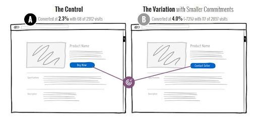
Ask your customers for smaller commitments, especially if you have a service company or sell expensive products that require special consideration. Changing your CTA buttons to softer alternatives to immediate purchases can work wonders.
For instance, changing a “Buy now” button to “Book a free consultation” is much friendlier for the commitment-phobic because it reassures the user that a conversation is the next step, not an ultimate purchase.
A recent test found that simply changing a main call to action to “Contact seller” from “Buy now” increased conversion rates by 73%.
4. Optimize UX design and copy
UX design or the user experience of your web design is perhaps the biggest decider of where a user will land. Make sure your website can be navigated smoothly and seamlessly. A great UX design is essential to increase website conversion rates.
The copy of your website goes hand in hand with your UX. Use active language and provide clickable options so users can go where they want without too much work. Expose primary navigation items at all times, so people can move through the website at will.
5. Reduce fields in contact forms
One of the primary ways to gain leads is to have people sign up via contact forms. Filling out these forms though can be a hassle. If your form has too many fields, people might skip signing up altogether. Remove as many barriers as possible.
Let a potential customer know the benefits of filling out a form. Set out expectations so you don’t fall short. Make sure your contact forms are conversational and friendly. Forms with too many fields are intimidating and people are often wary about giving out too much personal information.
Stick to fields that are necessary for conversion and do away with all the fluff that makes form filling a hassle. You should hopefully then find that your contact form submissions will increase.
6. Optimize customer support
Customers are more likely to buy when their concerns are addressed during their initial “buying” period, which is usually under a minute. You should have a support team available to handle queries via live chat and other channels, and have an automated system like automatic call distribution that can send the queries and questions to the relevant departments in the case of any phone calls.
Interactive voice response (IVR) is another tech example to consider to support any phone-based customer support. IVR is a form of speech recognition technology that allows customers to interact with an organization’s contact center with the minimum of fuss.
7. Optimize for mobile
Given the amount of traffic that is now sourced from mobile phones, it is important that you have a dedicated mobile format for your website. Failure to do this could result in a huge chunk of your potential customers being lost.
It is important that your mobile website is responsive and optimized for mobile use, which means button sizes and font sizes should be designed to work on mobile devices. Remember to be creative with mobile marketing – if done right and integrated with social media apps, it can help improve your conversion rate.
Make sure to also optimize any newsletters, e-mails and anything that goes through an SMTP for mobile, as they can result in new leads if formatted correctly.
8. Strengthen your ‘call to action’ point
The following guidelines can help create call to actions (CTAs) that will increase website conversion rates, as the right CTA can be all that’s needed to set you apart:
- Have a clear and bright CTA on the landing page.
- Keep your CTA simple and use active language to communicate value and urgency.
- Personalize your CTAs – Personalized CTAs perform 202% better than basic CTAs.
- Don’t use multiple CTAs on each page.
- Attract attention to CTAs by using pop ups. But remember not to be intrusive or disruptive to the customer experience.
Test before you launch
The eight examples listed above can all help boost your site performance, but all updates and changes to your site need to be tested after implementation.
Perform A/B testing on every change you make. Web design requires you to be on your toes and make changes every so often to optimize the content, while resolving any ‘pain points’ customers may be experiencing.
When embarking on your continuous conversion rate optimization (CRO) journey, using process discovery could also be invaluable. It can help you discover processes you may be able to automate in the future to improve the user experience of your website to reduce bounce rates, gain more leads and enhance conversion rates.
Once you have reached the point where your website resonates with your target audience, you can use a SaaS retargeting strategy to directly tackle those that do not convert. This method targets that part of your traffic that bounced and shows them ads to help drive them back to your website and hopefully convert.
If you follow all the advice above, test as you go and investigate how tech can assist you along the way, your conversion rates should improve accordingly.
Patty Yan
Patty is the EMEA Product Marketing Manager for RingCentral Office
The post 8 ways to boost your WordPress website conversion rates appeared first on UpdraftPlus. UpdraftPlus – Backup, restore and migration plugin for WordPress.


Recent Comments